Friday 29 April 2016

Elliot Kruszynski - Ideas for Illustrated Self

After looking at Luke Pearson and deciding I might want to try screen-printing for this brief, I remembered a screen-printed piece I saw when I was interviewed at Bath Spa. I couldn't remember his name though!! I'd previously made a note of this person and used him as a reference when I was on foundation at UCA last year but all my work from last year is back in Kent and all analogue so I couldn't look him up from that.

After scouring the Bath Spa School of Art and Design website and typing various things into Google (including things like Kruiskski, Kruyininsky because I remembered he had a name sorta like that), I found him again! And made a note of his name and Puck Collective which he belongs to.

ANYWAY

The piece in question:


Sooooo goooooooood

His work does remind me a little of Luke Pearson's and of Adventure Time. Very kinda cutesy and childish, but there's still evidence of a lot of digital and practical skill. The composition of the piece is also great, a good sense of depth and the rule of thirds being employed.

What I remembered most about the image was the portrayal of light and the colour scheme. Very simple, monotone, but very effective for its purpose as a poster for saving forests and animals, as well as for screen printing.

So this is another major influence for this brief right now.

Thursday 28 April 2016

Gemma Correll

I was on Instagram and saw a post that Rubyetc posted about a competition to draw a cartoon/comic about life on the web (which I may yet enter - more on that l8r), and I went to the web page for details and clicked on a link for examples of what could be submitted. I found this article about Gemma Correll's work.


She says in the article that she hopes using humour and straightforwardness when dealing with taboo topics is helpful for people, which I think it definitely is. The humour and simple low-fi cartoon style make the images more relatable to a wide audience, and opens up the conversation for serious issues such as mental health. 

This is also related to the article Leah showed me about illustration and mental health, which I made a post about a while ago.

Presentation planning so far

I have a feeling that the actual presentation for me will be fairly easy, because it's basically just talking about myself for ten minutes, and while that may sound narcissistic, it's a topic I know quite a lot about! I'm not great at presentations - I do struggle with confidence and I do think I'm better with words on paper where I have more time to plan them out and change things before it's written down, but overall I've accumulated a few public speaking skills from my school years so I think it won't be too much of a hassle.
This comic by Sarah Andersen kinda explains what I mean by being better on paper!

The actual planning of my presentation has also been fairly straightforward. I'm kinda thinking of it almost like planning an essay, because I've always enjoyed and been good at writing essays in school. You kinda just get all the main points and the introduction and the conclusion and then mash it all together.

So I've taken a page from the Illustrated Self brief and decided to do my presentation plan as a kinda map:

(rough draft)


I've just taken all the info from my blog and the presentation about the presentation and condensed it into the most important parts. Now for the planning of the actual slides!

Monday 25 April 2016

Illustrated Self - beginning to form ideas & Luke Pearson

I first came across Luke Pearson a couple of years ago when a friend bought one of his Hilda books. He has a really cute naive visual signature, with a great storytelling capability.

I didn't really think much about the crafting and composition of his work until Matt brought up his work in a presentation for visual language and again today for the Illustrated Self brief.


In this one he uses a tonal colour palette of warm reds and oranges, which provides a contrast to the bold blue of Hilda's hair. The composition is also considered, the rule of thirds playing a part in that Hilda is positioned in the bottom third and the background takes up the top two thirds. The characters in the background are also facing the opposite way to Hilda, leading the eye around the image, as we follow the direction of their eyes and the way they're positioned. The muted colour palette also suggests a sense of depth, as it is almost like a spotlight is on Hilda, the main character in the foreground, and the characters in the back are all in the dark.


Matt showed us this image today as part of inspiration for the Illustrated Self brief. Again, the rule of thirds is prominent with the colour scheme, and there's a strong sense of depth. The image is very busy but everything is still well spaced and your eye is drawn around the image with the lines of the building and the dinosaur's neck, for example. There's a lot more colour in this one but the palette is still harmonised and works well together. The overall colours are clearly blue, orange and purple, and the other colours do not overwhelm this palette.


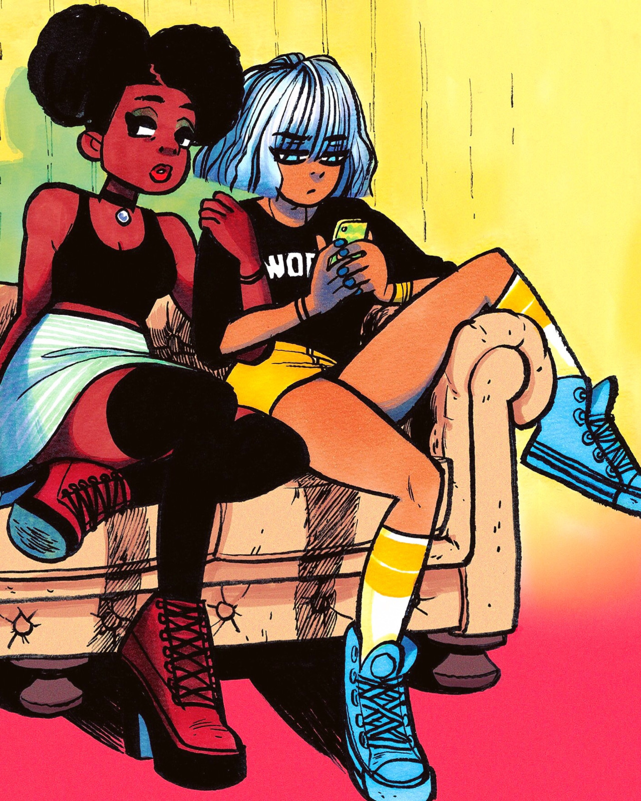
Luke Pearson is very adept at using muted colour palettes with one main hue - this makes me think back to the first brief we did - Typology. The effect of a simple muted colour palette is a lot stronger than cramming in load of colours which would overwhelm the image and draw focus away from the content, such as in the comic.

I think for my Illustrated Self poster I want to create something with a similarly muted colour palette, just choosing two or three colours and maybe screen print it?

Friday 22 April 2016

Bryan Lee O'Malley

Ah, Bryan.

This guy is the reason I got into comics in the first place. After watching the film adaptation of his series of graphic novels, Scott Pilgrim Vs. The World, I decided to read the books and my love of comics was born! This was also where I started to consider drawing comics myself - I'd never really read them much as a kid but with my love of drawing and writing stories, combining them seemed like the perfect fit.

He's also what kept me on the path to and Illustration degree, as opposed to the many other creative (and some non-creative) subjects I was considering for a degree. His work reminds me of my own love of drawing, and I love his style of drawing characters. He's influenced a lot by manga, anime and video games, and I'm influenced by him.


I love the way he draws people in his comics, as opposed to other artists I like, like Becky Cloonan, who take a more realistic approach to graphic novel illustration. He reduces people to simple forms and then exaggerates certain aspects of figures, like larger heads and eyes. I love this kinda cute style, with which you can write energetic stories to go with.

His sketchbooks are also mesmerising - I follow him on Instagram and Snapchat:


His proficiency with pens whilst colouring astounds me. He has a great grasp on tone, colour and light. I love the textures he incorporates into his characters, like pens slightly running out or not perfectly blocked within the lines. he also uses coloured pens to create folds within fabric or textures and tones in fabric like on the tights.


His line work as well is fairly 'messy' - I used to think (when I was young and naive) that his lines were perfect because they appeared that way in the comics, at the size they were reduced to. Now that I'm older and wiser (hopefully), I recognise that he actually draws a lot larger and reduces the images down to the comic size. This is something I need to get better at doing, as I still find myself drawing quite small and expecting my lines to be amazing-looking.


I should buy a larger (A3) sketchbook and spend more time practising drawing things larger and not wasting so much time on details when they're tiny.


You can also tell from his work that he's spent a lot of time observing people, poses, body shape and light etc. I definitely need to start doing more of this, just drawing ALL THE TIME


He also has proficiency with Photoshop - digital colouring and adding textures. Which is something I need to push myself to do more of! I have a graphics tablet but I'm kinda scared to use it. I'm scared of failure, but I really need to take more risks and spend more time just DRAWING and not being afraid, even if it goes wrong. I have definitely got better at king this - drawing straight on to paper with pen and drawing multiples of things instead of just rubbing it out if it goes wrong.

Thursday 21 April 2016

OUIL406 Visual Communication evaluation


Leeds College of Art
BA (Hons) ILLUSTRATION
Level
04
OUIL406 Visual Communication
Credits
20
End of Module Self Evaluation

NAME
Molly Halson


1.  What have you learned about visual communication during this module and how effectively do you think you have applied these ideas?
·         I've learned to think in simpler terms about image-making, especially during the 4 Cities brief. By this I mean reducing things down to their basic parts and using shape to communicate the message rather than focusing on lots of complex detail.
·         There are a lot of ways to communicate things, sometimes it's best with simplicity and reduction, and others better with symbols.

2. What approaches to/ methods of image making have you developed and how have they informed your concept development process?
·         I've improved my proficiency with Illustrator and vectors, which relates again to the reduction and communication of ideas - sometimes simple is better!
·         I've enjoyed learning how to make GIFs, even though I did struggle with the brief as a whole.

3. What strengths can you identify in your work and how have/will you capitalise on these?
·         I'm starting to loosen up my drawing style and take more risks within my work, being less concerned with perfection. This can actually work to my advantage, as with the Persons of Note brief.
·         I do still like and think I'm good at the process of roughing and getting better at drawing multiples of things in order to improve my general drawing skill.
·         I'm gaining confidence in my work and my practice through each brief as I try new things.

4. What weaknesses can you identify in your work and how will you address these in the future?
·         Probably the quantity - within some briefs, like the GIF brief, I wasn't really exhaustive in my approach to the task, and didn't really create that many ideas.
·         Similarly in the Persons of Note brief I didn't experiment that much with colour or media, I was kind of set from the beginning on what I wanted to do and didn't push any other ideas further.
·         I regret that I didn't really put my whole heart into the digital GIF. It had so much potential and I could have learned a lot more if I'd made the effort.

5. Identify five things that you will do differently next time and what do you expect to gain from doing these?
·         I say this every time (and I do really try) but I want to manage my time better. I need to start coming up with schedules or something and have dedicated time to working on briefs and not procrastinate.
·         Work with a wider variety of media.
·         Push myself to try different approaches to image-making and media, like digital.


6.How would you grade yourself on the following areas:
(please indicate using an ‘x’) 

5= excellent, 4 = very good, 3 = good, 2 = average, 1 = poor

1
2
3
4
5
Attendance


x

Punctuality


x

Motivation


x


Commitment


x


Quantity of work produced


x


Quality of work produced


x


Contribution to the group


x

The evaluation of your work is an important part of the assessment criteria and represents a percentage of the overall grade. It is essential that you give yourself enough time to complete your written evaluation fully and with appropriate depth and level of self-reflection. If you have any questions relating to the self-evaluation process speak to a member of staff as soon as possible.

Monday 18 April 2016

3 Posters evaluation


My personal favourite poster is the personal one - the draw stuff sometimes one. I think it perfectly encapsulates me personally - it's kind subtle, sardonic and self-deprecating humour, which is what I aspire to create.

My least favourite is probably the professional one - the one with me doing a handstand. I feel like I could have expressed those words better visually without including them? This one was a bit more rushed. 

The one that everyone else chose as the best one is the same as my favourite. I think the fact that it's simple and so relatable to other illustrators who procrastinate is the reason it was chosen.

Saturday 16 April 2016

3 posters initial development + artist research

I kinda struggled with completing this task in time for the deadline because of my lack of motivation and other issues I've talked about. I think another thing that was stopping me from making a start on this task was fear? In a way I'm kinda scared to confront my qualities, because I feel I have a lot of bad ones. Things like procrastination and motivation. Especially in terms of the professional poster. But then I don't get a chance to prove my good qualities if I don't start the task - it's all kind of a vicious cycle. Anyway, here's my initial development:

I identified in the poster session that one of my main qualities is humour and one of my ambitions is to make people laugh. Along the lines of these low-fi, kinda naive illustrations:

(Laurina Paperina)

(Catherine Faulkner)
"Hairy Potter" - visual puns 

(Kate Abey)
This one is a business card but it's kinda like a mini professional poster for her practice.

(Mr. Heggie)

I also identified my ambition to tell stories. Either full-fledged graphic novels or just little moments in comics like these (again using humour):

(Rubyetc)

(Sarah Andersen)

So in myself I value my humour, my organisation (despite my procrastination my room and ways of recording information/time-keeping are usually pretty organised), and my open-mindedness. Professionally I value my organisation (again - workspace/time-keeping with appointments/calendars etc), my ability to innovate and create ideas, my humour and my flexibility. And my ambitions, again, are to make people laugh and tell stories.

SO

time to get crack-a-lackin'

Sunday 3 April 2016

Self-care failure

Before Easter I made a post about self-improvement. Before I went home for the holiday, I made a chart/calendar encompassing all the things I wanted to do:

  • How many cigarettes I'd smoked that day
  • 3 things I'm thankful for
  • Whether I'd done exercise
  • Whether I'd done yoga
  • Whether I'd meditated
  • What time I woke up


How this failed:

  • I was putting way too much pressure on myself to do all these things at once, and it probably pushed me a bit further down. I thought I was taking baby steps, but I was still trying to take too many baby steps.
  • When I didn't complete a task or goal I set myself, like not writing down the 3 things, waking up at noon, smoking more than 4 cigs etc, I could always see the chart, mocking me. Eventually my mum ripped it up after we had a tearful chat about what I was doing to myself.
  • I thought I was getting better straight away, but these things take time and I really was pushing myself way too much. 


What went well (it wasn't all bad):

  • I did manage to go for a 4.5 mile walk/run (was supposed to be a jog but I'm quite unfit) with a friend along the beach on a sunny day, and did a few walks down cycle paths, up hills and along the beach.
  • Because it was Easter, I did eat a fair bit of chocolate, which I felt guilty about, but I otherwise tried to eat healthily, with mum supporting me - like when we had spag bol for dinner, my mum and I had it with spinach instead of spaghetti.
  • I didn't manage to do as much work as I planned in the first 2 weeks of holiday, which got me down further, but I did manage to get my mum to sit with me and push/motivate me in the last week - so I finished some stuff for Visual Language and the last Vis Com brief.


What I'm going to do now:

  • NOT change my smoking habits. There's still a lot of pressure and smoking is a coping mechanism for stress, so I'll try to quit again in summer.
  • NOT meticulously write down 3 things I'm thankful for. I think it became more of a habit rather than a help - I was just doing it for the sake of completing the chart and not actually thinking about it.
  • NOT push myself to do loads of exercise or yoga straight away. I've started walking up the 5 floors to my flat by stairs instead of using the lift, as an added bit of exercise. I still always use the stairs at uni too.
  • I am managing mostly to read before bed instead of watching TV, even if I still go to bed late.
  • I do still write little post-it note mantras around my room to keep my positivity flowing.