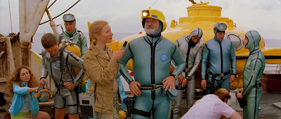
All his scenes are carefully composed and constructed down to the last minute detail, and everything is thought about. The visual elements of frame, composition, line and depth are all thought about and employed well. There's always a strong theme of symmetry in his cinematography, and colour schemes and patterns/textures are thought about and pieced together beautifully. There's a childlike naivety as well as vintage and retro visual themes running through his work, and although Anderson is not an 'illustrator', each scene and composition of set tells its own narrative without even needing the characters.
I really admire his ability to tell a story through set design - it's not all about the characters and the people - the context the characters appear in must be considered too. His colour palettes are always beautiful and I often look to him for inspiration, as well as because his films are amazing!


No comments:
Post a Comment